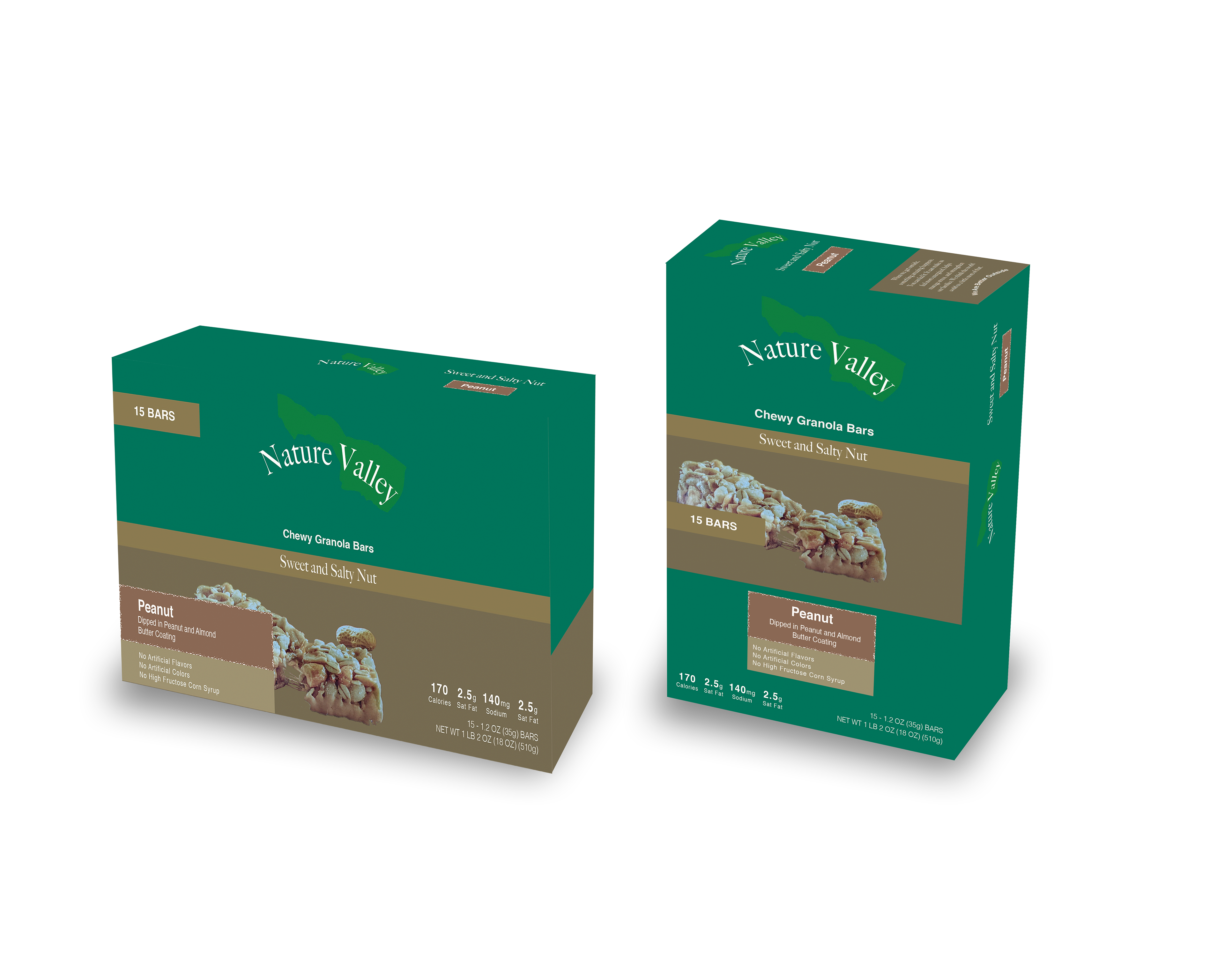
The redesigning of the Nature Valley granola bar packaging included a lot of visual research. My goal going into this was to simplify the original packaging because they had too much text and not enough room to breathe. The color palette was also way too bright and not easy on the eyes at all. The designing process began with researching the original packaging and deciding which information was needed and what wasn't. I then looked up various images of valleys to acquire a color palette that I thought was fitting. The logo came about by creating an illustration of a valley and simplifying it, so it was still able to come across as a valley.